Gravity Grotesk typography 1.4
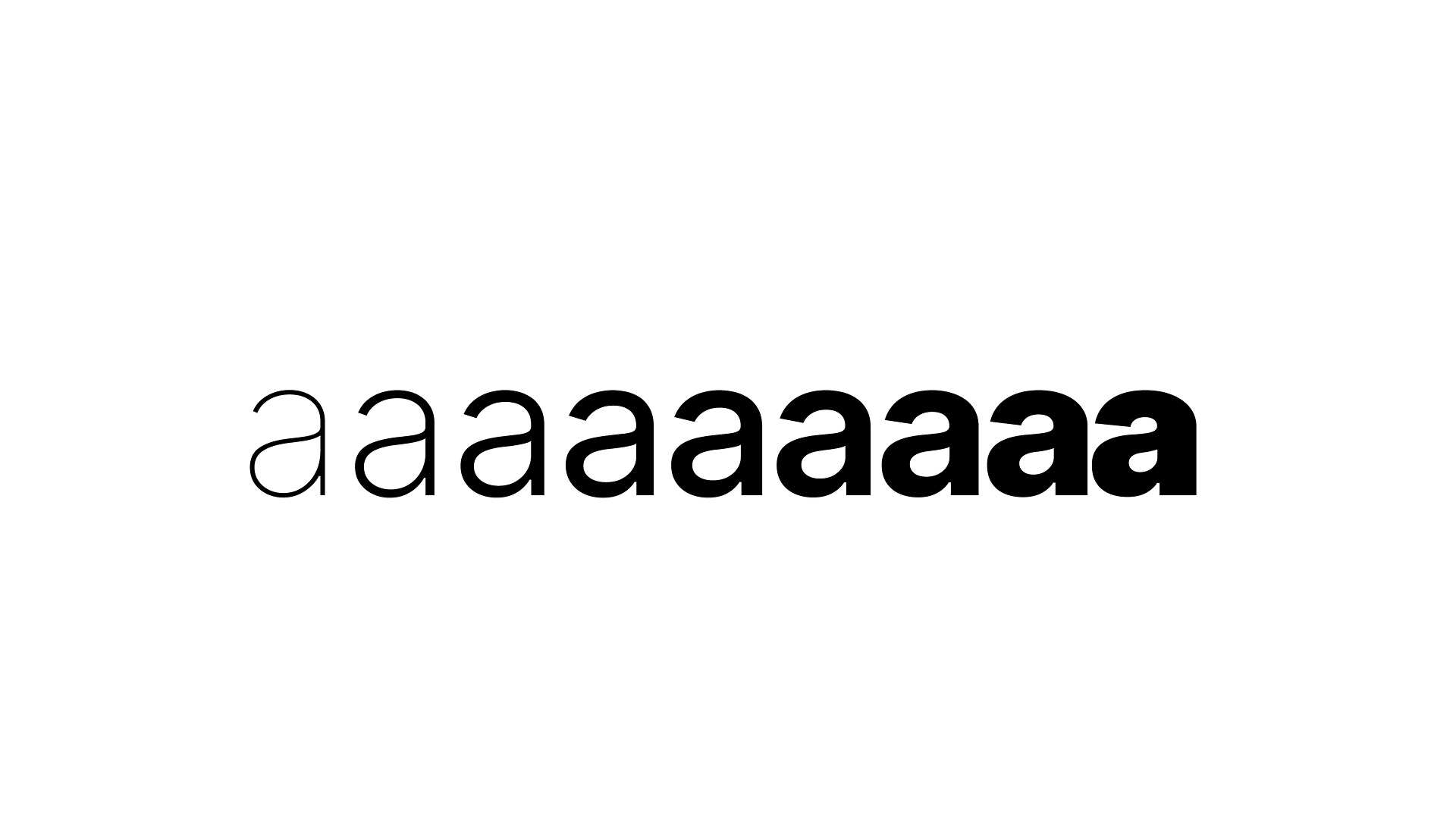
Gravity Grotesk is a neutral sans for my web. A lower x-height and tighter spacing give it a grotesk voice. Flat ledges where curves meet stems, angled terminals, and a thin-flagged 1 give it a character of its own. Gravity Serif shares its x-height, cap height, and line height, so the two mix on one line.
Family
Gravity Grotesk, Gravity Grotesk Italic, Gravity Serif, Gravity Serif Italic
Weights
Variable 100–900, plus 9 static weights per style
Language support
Latin incl. all Central European, Greek, Cyrillic
Features
Tabular figures, fractions, superscripts, small caps, case-sensitive
forms
Formats
TTF variable and static, WOFF2 for web
Version
1.400 — October 2026
Don’t miss the next essay. Sign up for our newsletter
⸻ Newsletter signup
Should designers code?
Should designers code? We've been asking ourselves that question since 2004 — across identities, interfaces, and campaigns where design met production head-on. The answer depends entirely on what kind of designer you want to be, and what kind of work you want to make. Should designers code is the wrong binary; the real question is how much of the medium should you understand before you hand it off.
Why Branding and Web Design Must Be Aligned
Branding and web design alignment fails the moment two separate teams touch the same project without talking to each other. We've watched it happen — a considered identity system lands on a site that treats it like decoration. Branding and web design alignment means the strategy that shapes the mark also shapes the architecture, the copy rhythm, the interaction logic.
Why so serious?
We ditched the books, picked up a pen, and let strange creatures appear. Turns out that's not a detour — it's how branding actually starts.
Sometimes we all need a little push
Need a little push before you can finally commit to a branding project? We've heard that hesitation hundreds of times — and it rarely has anything to do with budget. After 20 years and 81 logos, we've learned that the thing holding most businesses back isn't readiness. It's the wrong idea of what readiness looks like. Sometimes all it takes is someone telling you: you're closer than you think.
The highest award for a designer: finished work, payment, and client bragging
Designer success metrics are rarely what the industry tells you they are. We've delivered 128 projects across two decades, and the measure that holds is deceptively simple: the work is out in the world, the payment landed, and the client is doing your marketing for you. Those three moments, in sequence, define whether a project actually succeeded.
There Is Only One Right Way to Publicly Commission Design
Public design commissioning is not a matter of preference — there is a right way and everything else. We've worked through enough flawed briefs, misaligned procurement structures, and well-meaning but broken processes to know exactly where the public commissioning of design goes wrong, and what it looks like when it doesn't.
Slovenia the fun facts
Slovenia fun facts are rarely what they seem. The bear counts and flute discoveries are real enough — but the stories built around them, the way a nation curates its own mythology, that's where the design work begins. We've been pulling apart Slovenian cultural identity since 2004, and the gap between documented fact and inherited fiction is where the most interesting visual problems live.
Process
Design process methodology, as we practice it, is not a straight line from brief to delivery. It loops — deliberately, productively, sometimes uncomfortably. That looping is where the real work happens, and understanding our design process methodology is the clearest way to know whether we're the right studio for what you're building.