How do you brand alpine longboards that celebrate Slovenia’s mountain riding culture?
Dimension Two longboard brand needed an identity that captured Slovenia’s alpine culture and alternative outdoor philosophy. We developed a complete brand system for Dimension Two that translates their “second dimension” concept into distinctive visual language.
Client: Dimension Two
The brief
DTWO needed an identity that reflected their geographical reality — Slovenia’s alpine terrain demands different approaches to longboarding than beach cultures. We had to translate their philosophy of alternative paths and local craftsmanship into cohesive visual language that would resonate with Slovenia’s outdoor community.
Visual system
We built a mark that plays with dimensional shifts, paired with alpine-inspired typography that balances precision with longboard culture’s relaxed spirit. The identity uses clean geometry contrasted against organic wood textures, reflecting the duality of their craft and geography.
Outcome
DTWO launched with distinctive presence in Slovenia’s alternative sports scene, successfully communicating their artisanal approach to the longboard community.
Brand identity · Logo design · Typography · Packaging · Photography direction


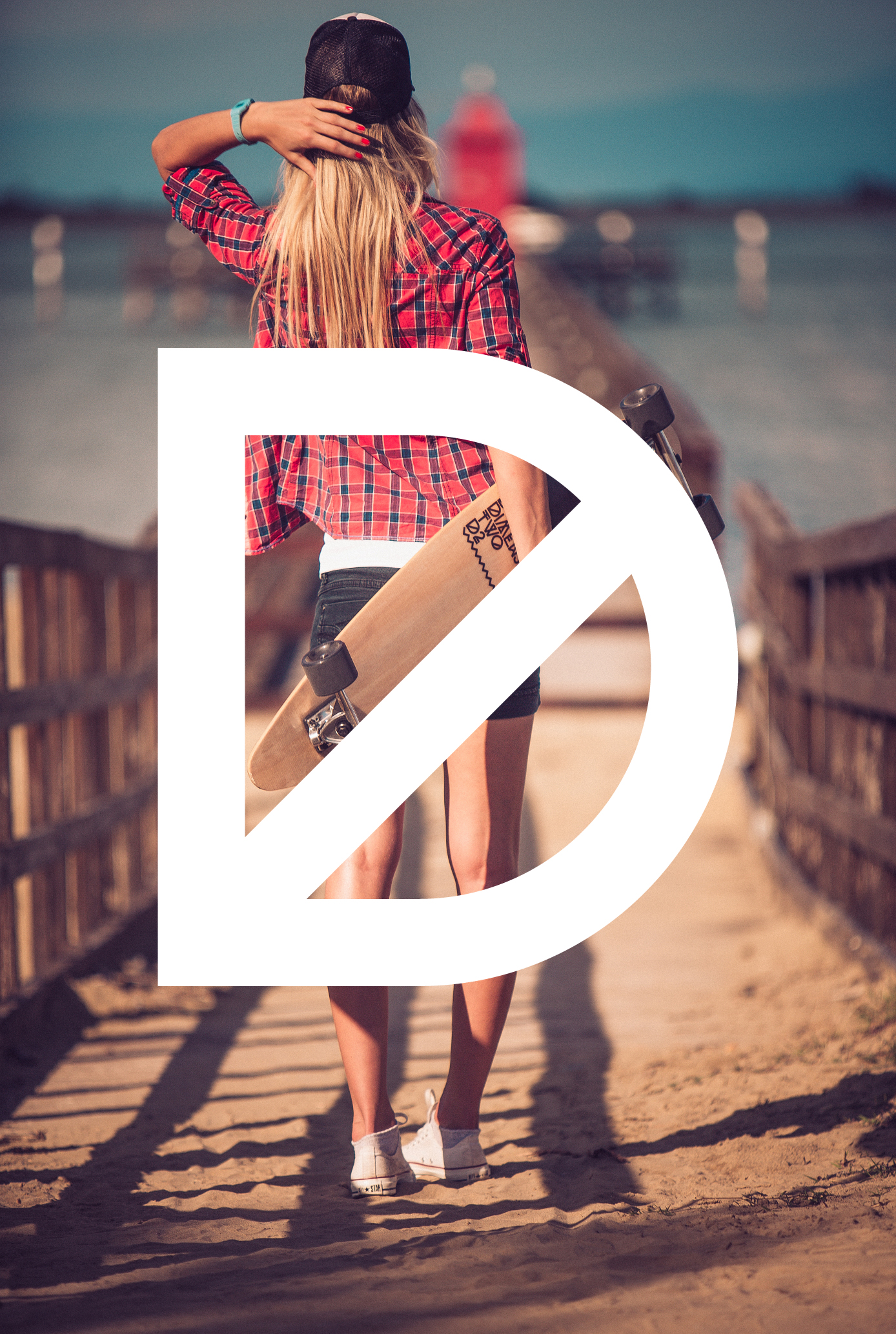
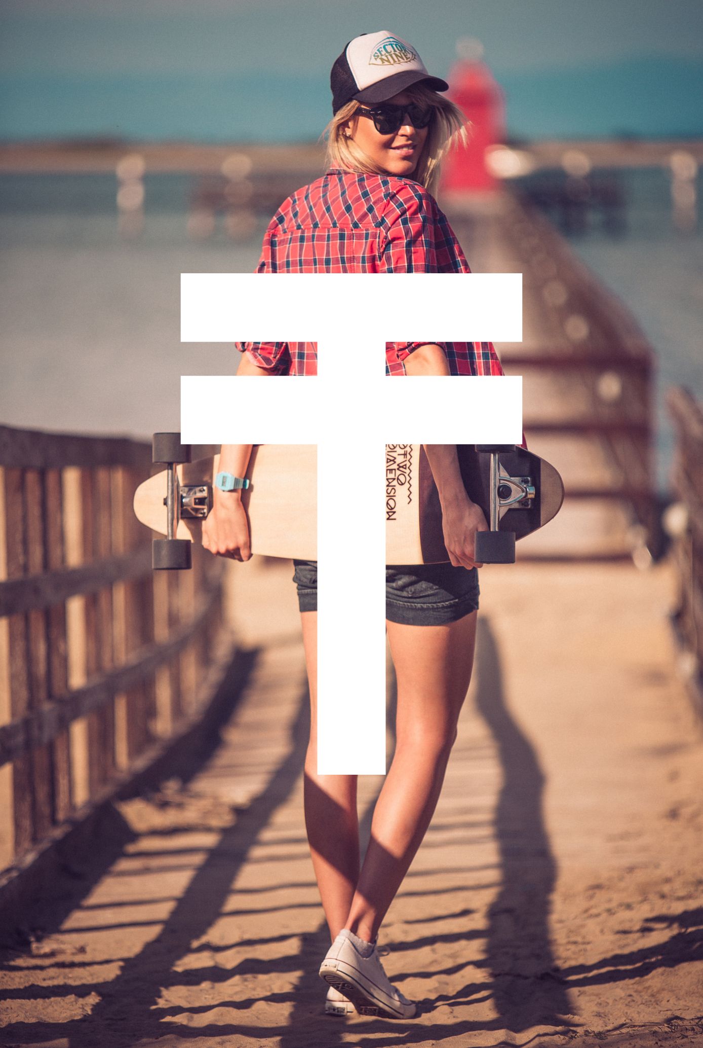
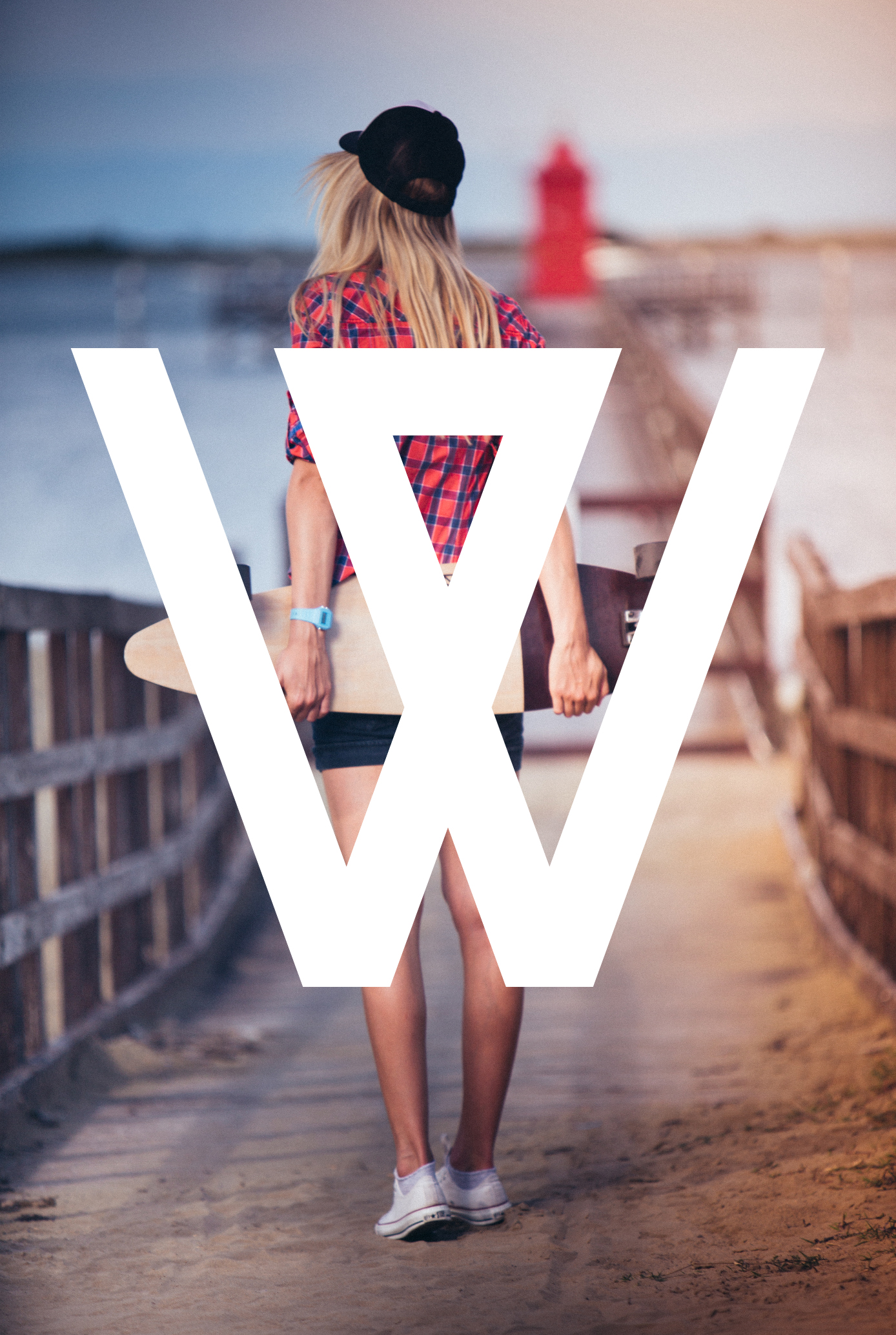
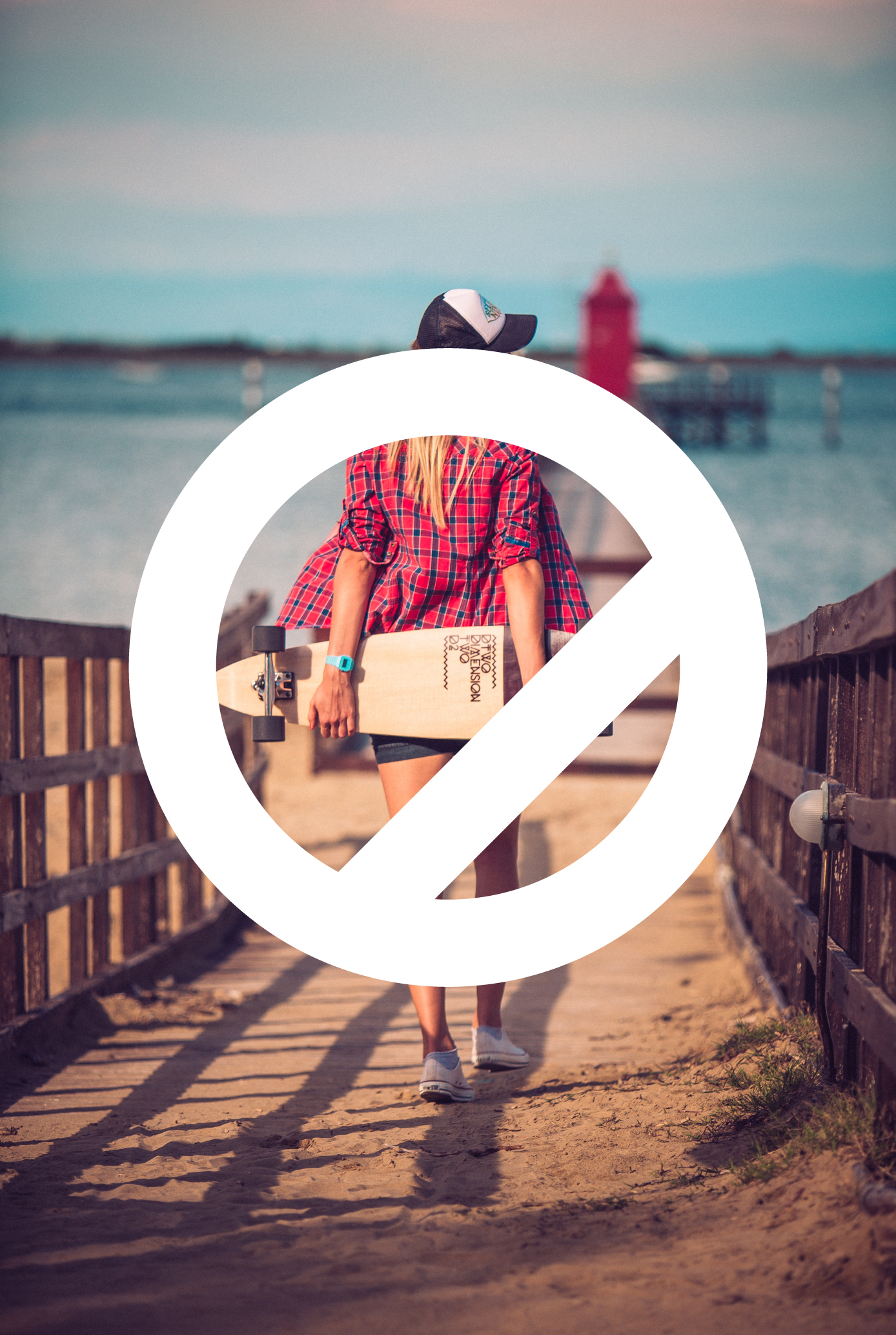


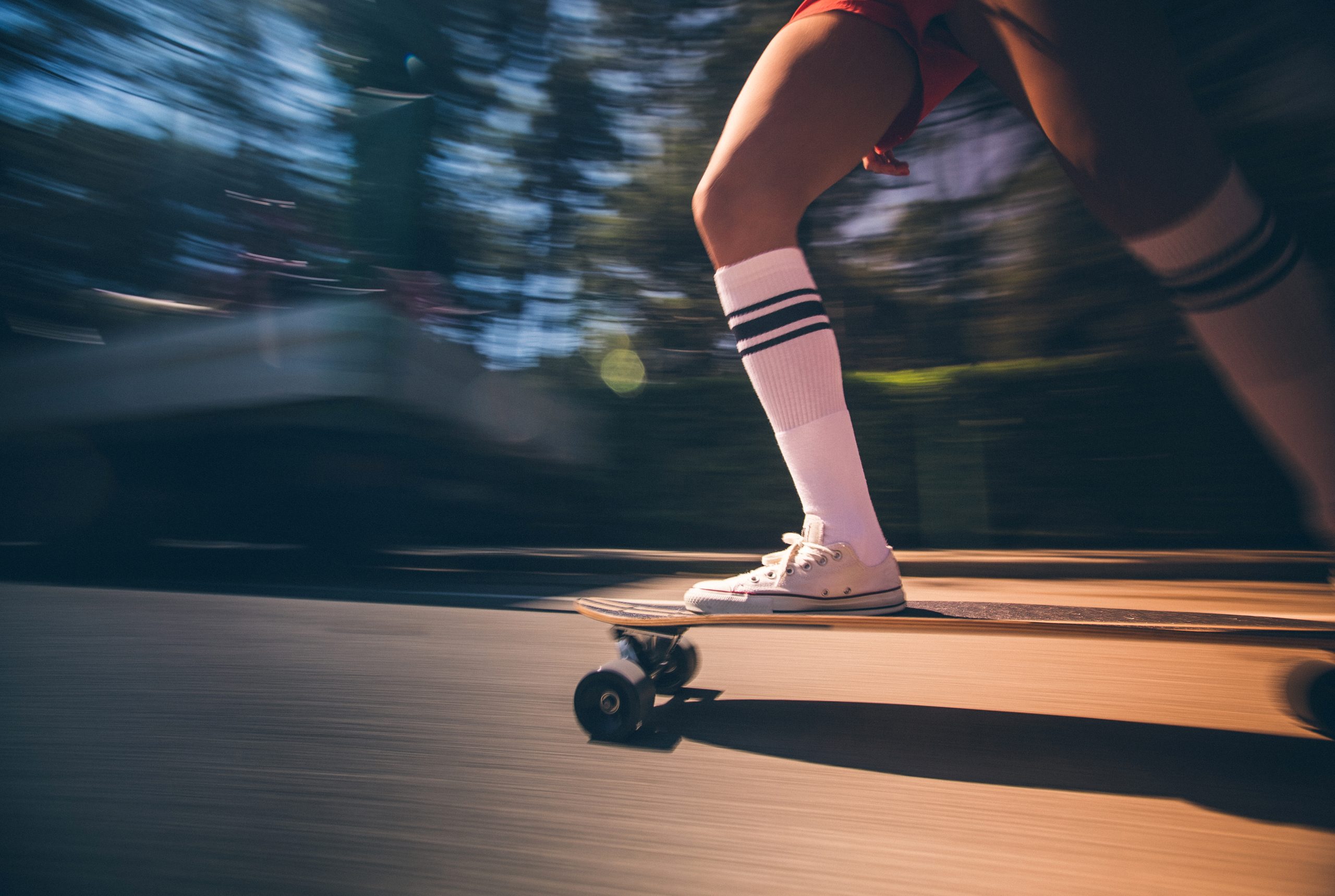


Branding a longboard company that lives in Slovenia’s second dimension.
The Why behind Dimension Two is their philosophy of stepping outside conventional boundaries — longboarding as escape from the flat world into alpine terrain. The What we built is a complete brand system that translates this dimensional thinking into visual language. The How: we avoided the predictable mountain peak iconography and instead worked with layered forms that suggest depth and movement between planes. The Values center on authentic alpine culture, not tourist postcards of Slovenia.
The Design system uses typography that shifts between weights like a rider shifting between dimensions — heavy for impact, light for flow. Color palette pulls from actual alpine conditions: stone gray, snow white, the specific blue of high-altitude shadows. I made the logo modular so it could adapt across board graphics, apparel, and digital without losing its core identity. The Story emerges through application: each touchpoint reinforces the idea that this brand exists in the space between conventional ground level and pure verticality — exactly where longboarding happens in mountain country.