How do you bottle the imperfect beauty of human relationships?
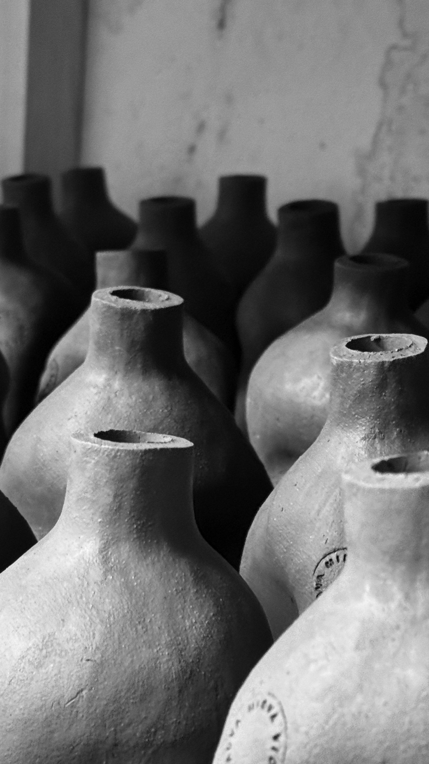
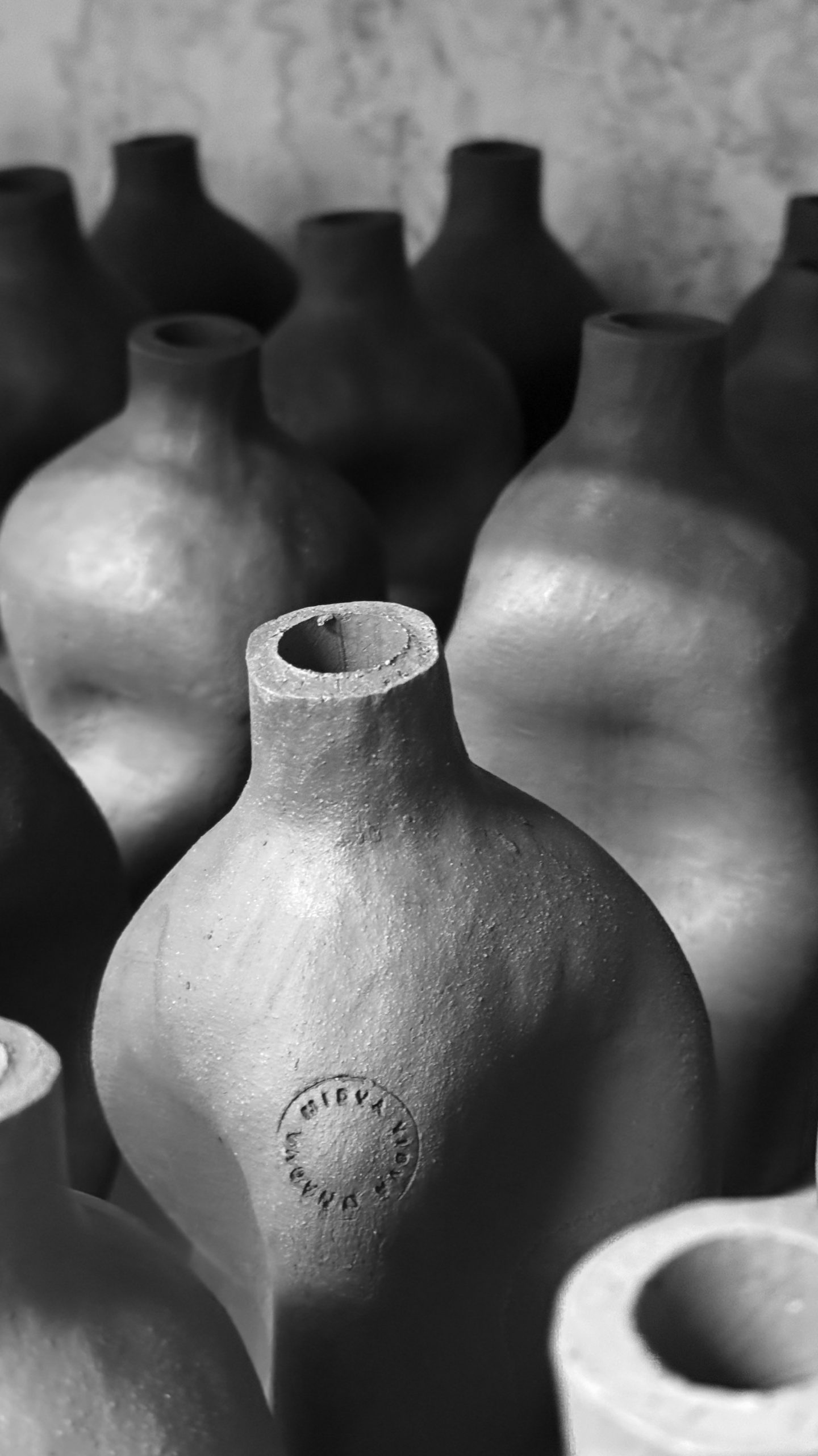
Handcrafted packaging design requires abandoning industrial perfection for authentic variation. We shaped clay bottles by hand for Midva vidva onadva, where each handcrafted packaging design celebrates the imperfect beauty of human relationships through tactile ceramic surfaces.
Client: Midva vidva onadva
The brief
Every relationship shapes us into imperfect perfections — this philosophy demanded physical form. We approached each bottle as a meditation on connection, where deliberate irregularity becomes the essence of beauty rather than its flaw.
The craft
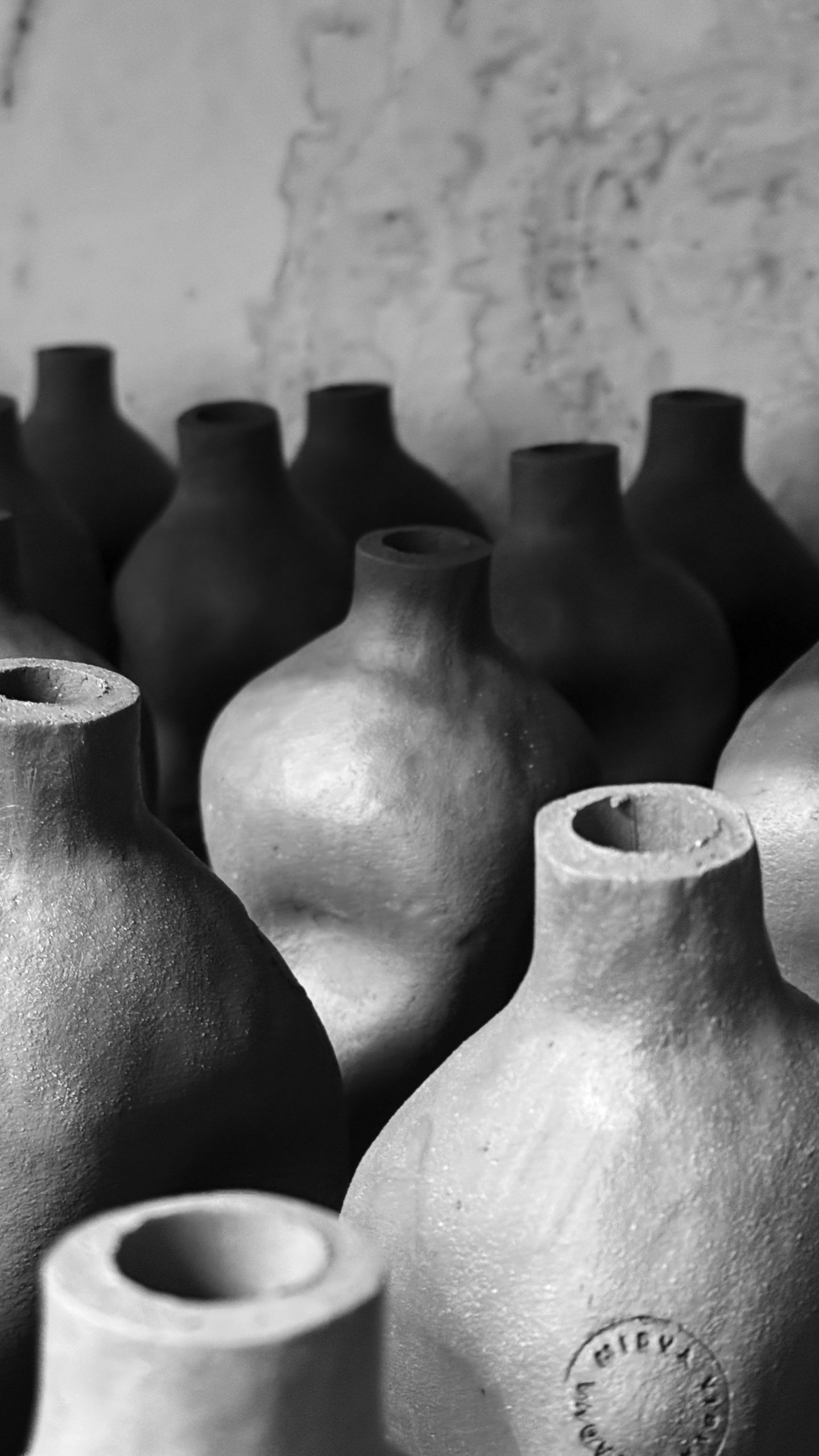
We shaped each vessel by hand using traditional Slovenian ceramic techniques, allowing natural variations to emerge through touch and fire. Even the labels were printed with clay-based inks, creating a completely tactile experience rooted in earth’s most elemental material.
Outcome
A limited collection where each bottle bears the unique fingerprints of its making. Industrial perfection gives way to authentic variation — flawed, individual, human.
Concept development · Handcrafted bottle design · Clay label printing · Product photography
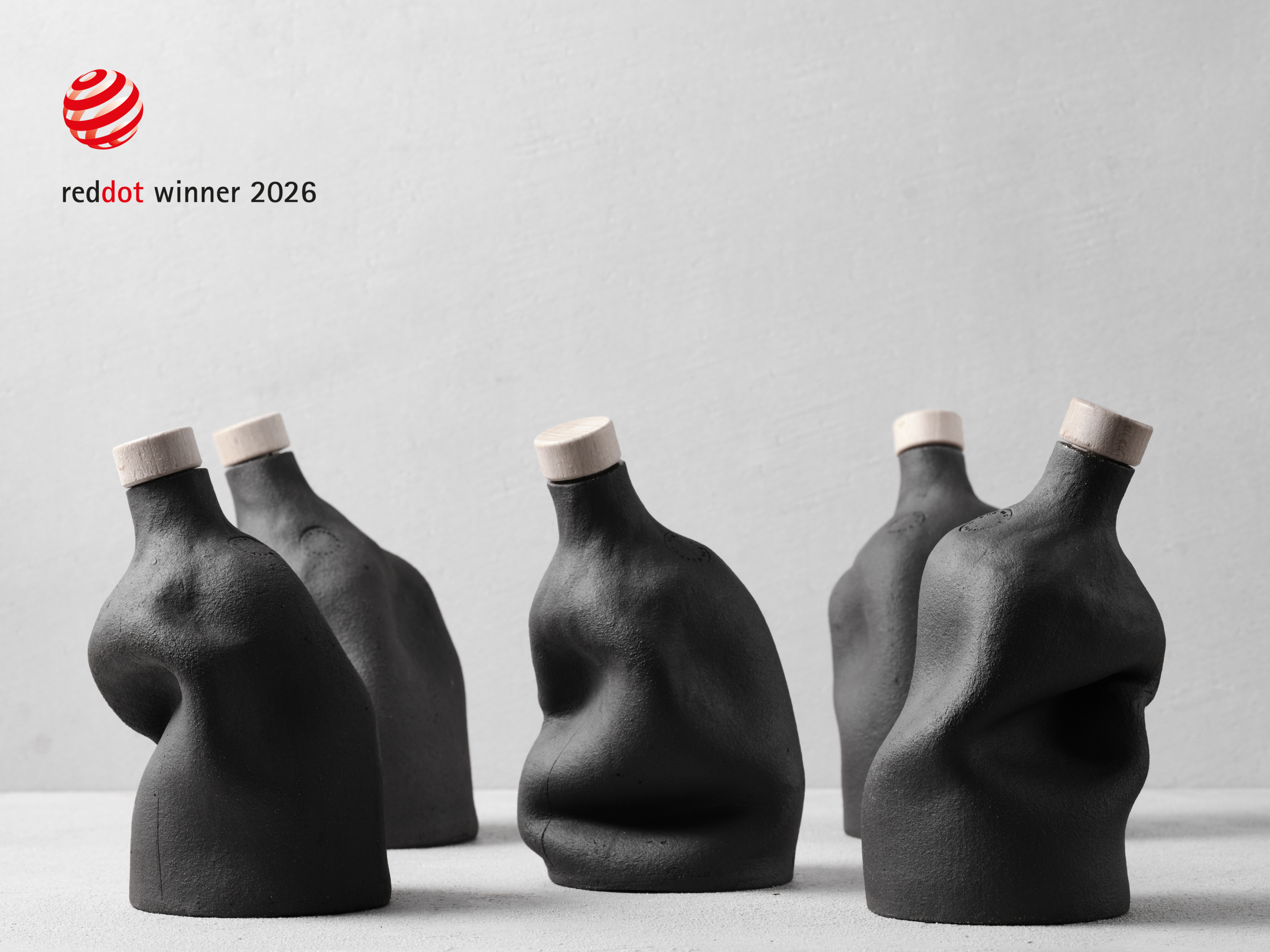
Red Dot Award Winner — Midva Vidva Onadva received the prestigious Red Dot Award for its distinctive packaging design. The handcrafted clay bottle, stripped of labels and unnecessary decoration, celebrates authenticity, Slovenian beekeeping heritage, and timeless craftsmanship. Through its sculptural form and honest materials, the design transforms a traditional honey liqueur into a memorable premium brand experience.


“Midva Vidva Onadva” starts with a simple idea: we are shaped by our relationships, and no two are ever the same.
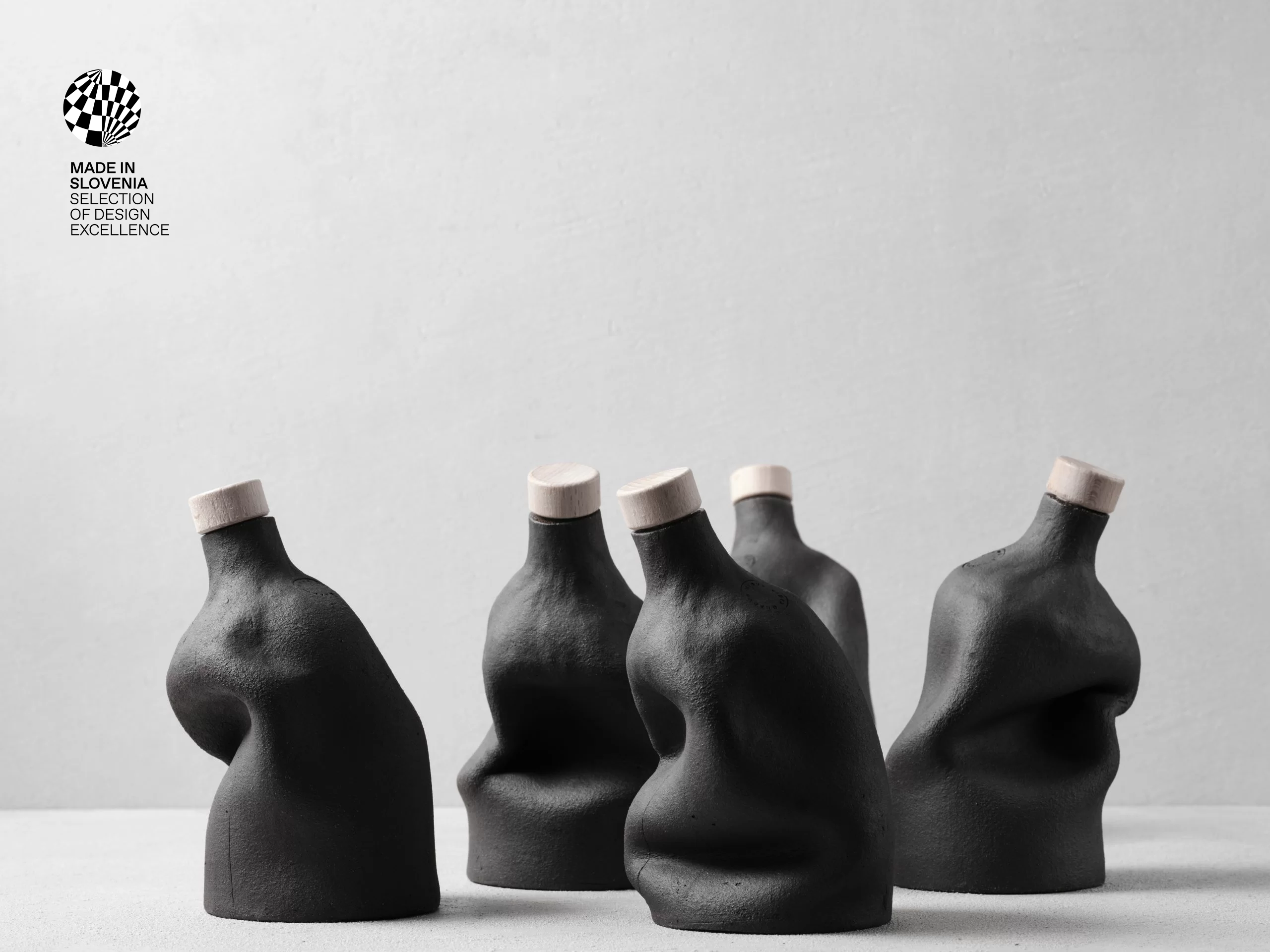
The name comes from a Slovenian expression that roughly translates as “the two of us.” It became the foundation of the project. There is no label to carry the story. The bottle is the story. Every piece is shaped by hand, making each one unique. Every form is a reflection of us.
The liqueur follows the same philosophy. It is a handcrafted Slovenian honey liqueur made from a family recipe passed down through generations. Inspired by Slovenia’s beekeeping heritage and the protected Carniolan honey bee, the project celebrates patience, craftsmanship, and tradition. Produced in small batches, it matures for an entire year. Slow to make. Impossible to rush. Just like meaningful relationships.
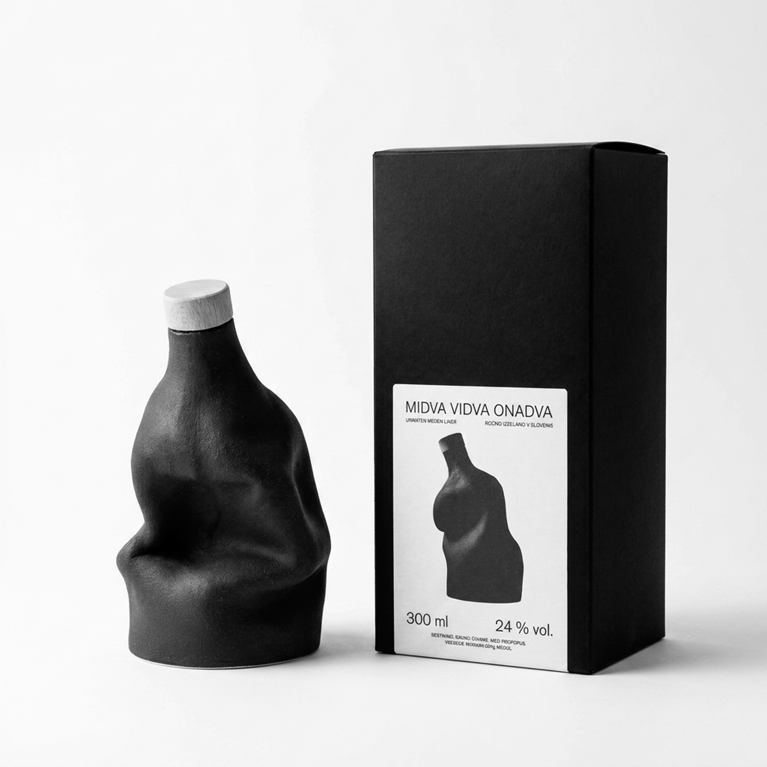
Each ceramic bottle is individually formed, leaving subtle variations in shape, texture, and the marks of the making process. The minimal clay label doesn’t decorate the object. It simply identifies it.
The intention was never to create disposable packaging. Once the bottle is empty, it begins a second life as a ceramic sculpture—something worth keeping as a memory of the relationships that shaped us.
Midva Vidva Onadva is not about perfection. It is about imperfect perfection. The beauty found in people, relationships, and the marks they leave behind.


The team behind it:
Production: Visualbrangravity (Gregor Žakelj)
Clay manufacturer: Studio Levo (Rok Oblak, Jakob Mihevc, Christopher Klares), Gregor Žakelj
Bee liquor: Mr.Bee (Nika Polsek)
Box: Tiporenesansa (Marko Drpić)
Label: print: Artiko (David Tavčar)
Photo: Lovro Rozina
Stamp: Sitar 1920
Special thanks: Ursa Culiberg
Volume: 300ml
Alcohol: 24‰ vol.
Shops:
Olivers&Co https://oliviers-co.si/
IKA https://www.trgovinaika.si/
MAO / Center za kreativnost https://mao.si/


Midva Vidva Onadva’s Bottle Is a Piece of Sculptural Art
By Chloe Cordover
Published June 15, 2026 on The Dieline
Packaging has been having a sculptural moment, but Midva Vidva Onadva is my favorite one I’ve found within the spirits space. Designed by Visualbraingravity, each bottle is hand-formed ceramic shaped into an abstracted torso, and no two are exactly alike.
The matte black finish looks almost like fired clay or volcanic stone, grounding the product in something ancient and earthen. The imperfect surface is doing a lot of the storytelling. This is a honey liqueur rooted in Slovenian beekeeping tradition, and the roughness of the material echoes the product’s raw, handmade nature.
What really sets this apart is that there is no label at all. The bottle is the design. Each silhouette is slightly different, referencing the Slovenian tradition of the Carniolan honey bee and the intimate, two-person nature of the brand name (which translates roughly to “the two of us”). It looks like it belongs in an art gallery as much as it does my very own bar at home.
What really sets this apart is that there is no label at all. The bottle is the design. Each silhouette is slightly different, referencing the Slovenian tradition of the Carniolan honey bee and the intimate, two-person nature of the brand name (which translates roughly to “the two of us”). It looks like it belongs in an art gallery as much as it does my very own bar at home.
What if no two bottles were exactly alike? For Midva vidva onadva, the answer became the foundation of the entire packaging concept. Crafted entirely by hand, each ceramic bottle celebrates the imperfect beauty of human relationships, transforming individuality into a tangible design experience.
Rooted in the belief that every relationship shapes us into imperfect perfections, the project embraces irregularity as a mark of authenticity rather than a flaw. Each bottle was hand-formed using traditional Slovenian ceramic techniques, allowing subtle variations in shape, texture, and surface to emerge through touch and fire. As a result, every piece becomes unique—much like the connections it represents.
The tactile experience extends beyond the vessel itself. Labels printed with clay-based inks reinforce the material narrative, creating a packaging system grounded in earth’s most elemental medium. Together, craftsmanship, materiality, and symbolism converge to create a collection where no two bottles are the same, reflecting the individuality and beauty found in every human relationship.


Selected mentions:
https://thedieline.com/midva-vidva-onadva-sculptural-bottle-design-visualbraingravity/
https://packagingoftheworld.com/2026/06/midva-vidva-onadva.html
https://www.marketingmagazin.si/aktualno/dizajn/11624/gregor-zakelj-z-unikatnimi-glinenimi-steklenicami-navdusil-the-dieline/novice
https://worldbranddesign.com/midva-vidva-onadva-handmade-unique-package-design
Every relationship leaves marks — so should every bottle.
The Why behind Midva vidva onadva is that human connection cannot be mass-produced, so neither should its container. The What — hand-shaped clay bottles for honey liquor — rejects industrial uniformity for deliberate imperfection. The How: traditional Slovenian ceramic techniques in our Ljubljana studio, where each vessel emerges differently from the wheel and kiln. No two bottles match because no two relationships match. The Values are craft over efficiency and authentic variation over perfect replication.
The Design works because the irregularities are not accidents — they are arguments. Each thumb print in the clay, each fire mark, each label that sits slightly off-center tells the same Story: beauty lives in the spaces between perfection. The ceramic surface invites touch in a way glass never could. When you hold one of these bottles, you feel the maker’s hands and, through them, the idea that imperfection is not compromise but completion.